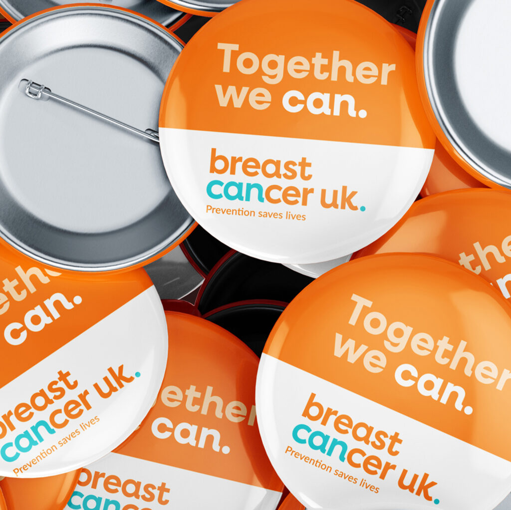
To give Breast Cancer UK a clear, confident voice people can trust.
DELIVERABLES
Brand strategy
Copywriting
Brand identity
Brand guidelines
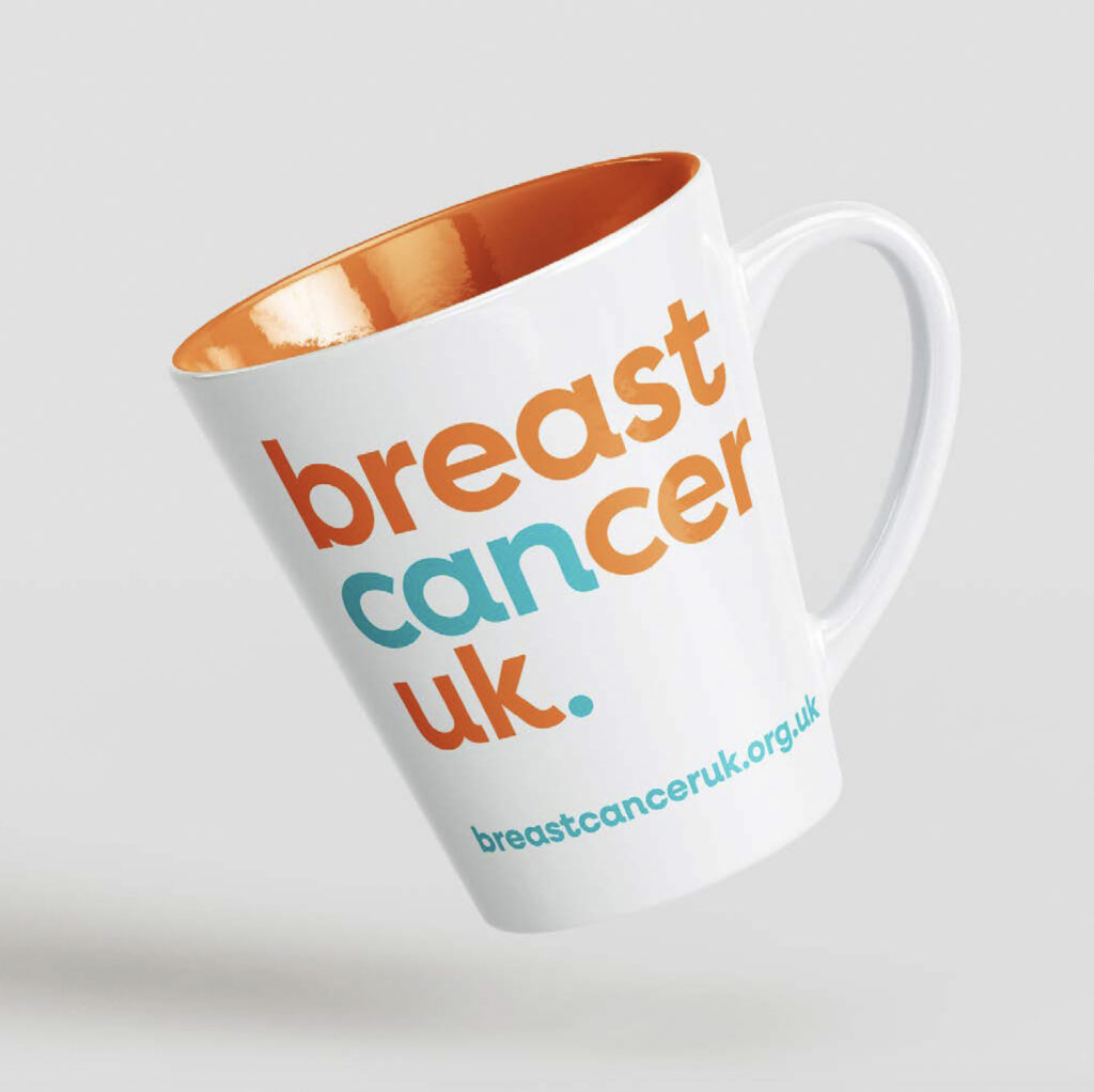
Merchandise
The challenge.
Breast Cancer UK had a vital, prevention-led mission – but their brand wasn’t cutting through in a crowded, pink-dominated sector.
They needed to stand apart.
Not just visually, but in how they spoke, showed up, and were understood.
The shift.
A simple but powerful idea was hiding in plain sight: ‘can’.
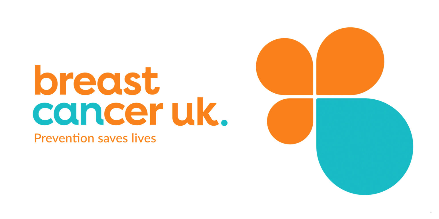
By reframing the word within cancer, we created a foundation for a brand rooted in belief, possibility and action.
What changed.
A distinctive identity that moves beyond sector clichés.
A confident, approachable tone that builds trust.
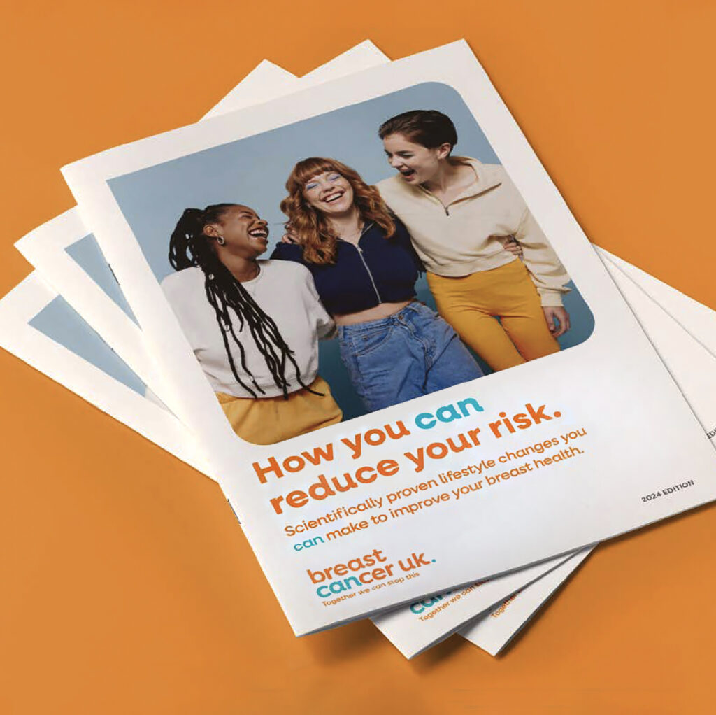
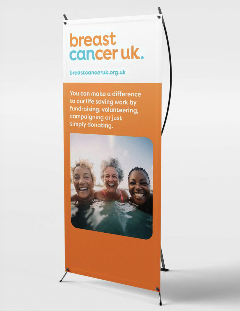
A system that works across digital, print and campaigns
A narrative that puts prevention at the centre.
The impact.
A brand that feels clearer, more confident, and unmistakably its own.
Helping Breast Cancer UK connect with a wider audience and strengthen belief in prevention.
Dora and her associates were a great fit for us. From the get-go they worked closely with our team to get to the heart of our cause and bring our brand story to life. The result is a subtle but powerful transformation of our brand that will help us reach a wider audience. They nailed it!”